Case Study
THE PROBLEM

THE AUDIT
DESIGN DECISIONS
Decision 01
Lead with brand tone, not product
Why: Trust is built before a purchase decision, not during. A user who arrives skeptical and leaves impressed is more likely to buy than a user who sees product before brand.
Decision 02
Why: Skincare buyers need proof of results before they're willing to explore further. Moving this from the footer to second position increased implied engagement in every round of feedback.
Decision 03
Why: Reduce clicks to decision, not increase them. E-commerce friction lives in the gap between 'I want to look' and 'I want to buy'. Closing that gap is a layout problem.
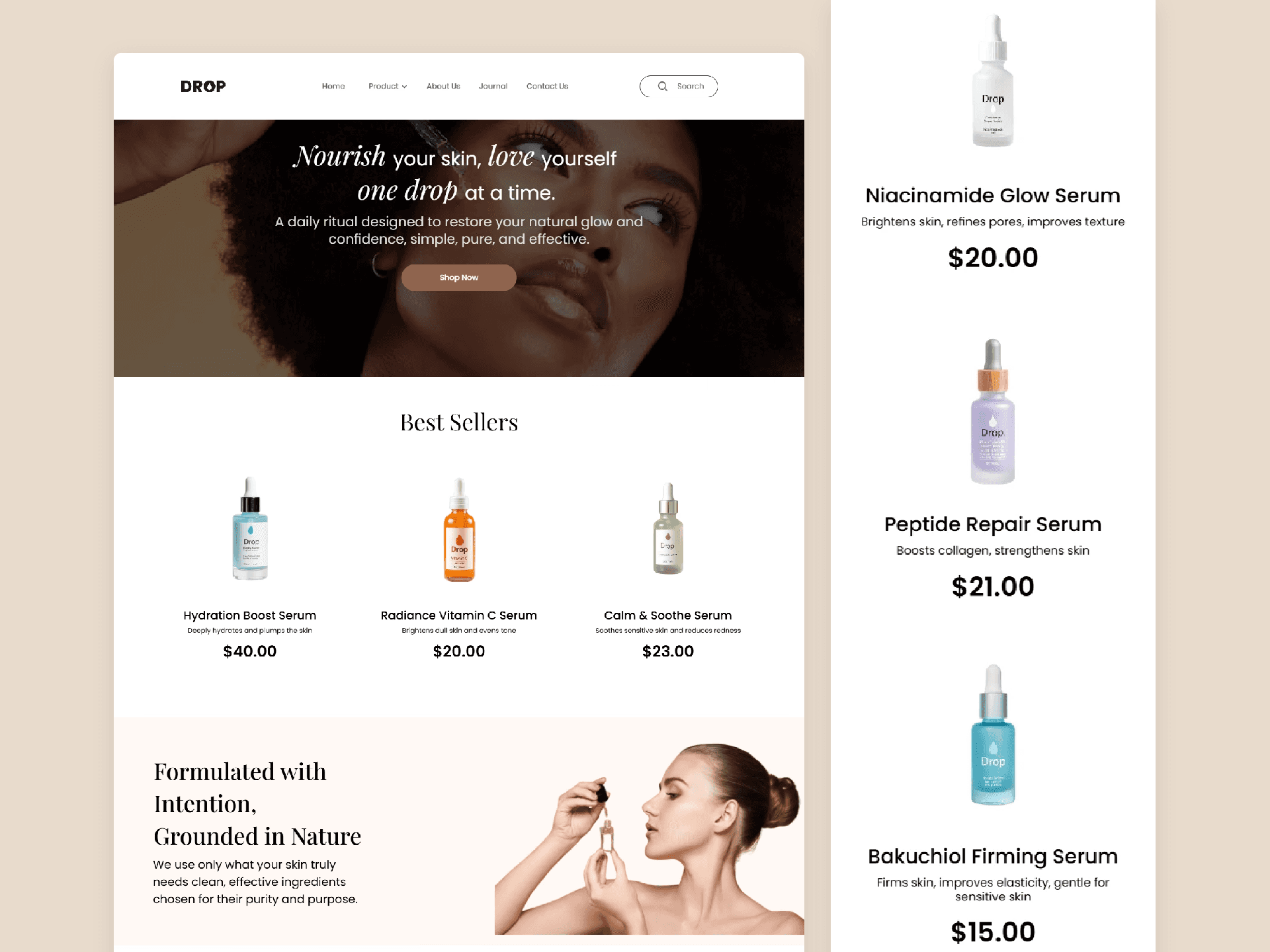
THE SOLUTION

Individual Product Pages go deeper full ingredient stories, skin benefits, and usage guidance. Designed to convert the considered buyer who needs more information before committing.
Newsletter Capture was built around an incentive; 15% off the first order positioned at the bottom of the homepage to catch visitors who browsed but didn't buy. A second conversion opportunity without interrupting the main shopping flow.
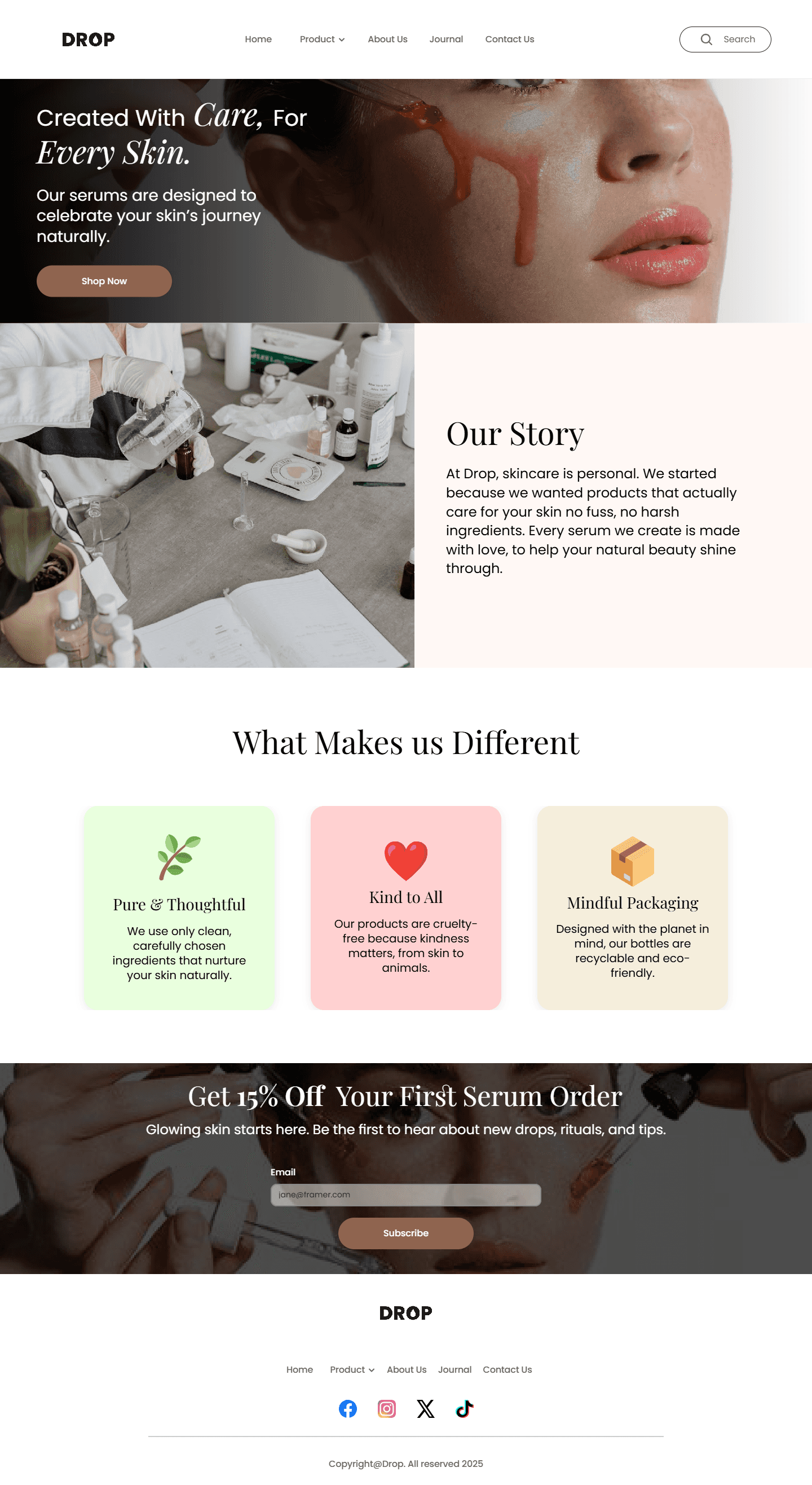
The About Page gave the brand a human side, the story behind Drop, the philosophy of clean formulation, and the belief that skincare should be simple and intentional. Designed to build emotional connection with visitors who want to know who they're buying from before they commit.
The Journal extended the brand beyond product, a content space for skincare tips, rituals, and ingredient education. Designed to build brand authority and give users a reason to return even when they're not actively shopping.

Impact & Results
9
Pages
Most concept projects stop at mockups. Drop didn't. Brand identity, product catalogue, social proof, newsletter capture, and a live shopping experience designed and built solo in one month. A fully functional site that shows what end-to-end product thinking looks like when design and development are treated as one process.