Case Study
Troz
Troz
A driver app for check-ins, trips, earnings, and incident reports in one place
A driver app for check-ins, trips, earnings, and incident reports in one place
Role
UX/UI Designer
Duration
3 weeks
Platform
Mobile
Year
2026
OVERVIEW
OVERVIEW
Designed from scratch. In 21 days.
Designed from scratch. In 21 days.
Designed from scratch. In 21 days.
Troz is a mobile application for logistics company drivers. Before it existed, driver operations ran entirely on manual processes shift management, van condition checks, incident reporting, and payroll tracking all disconnected, all prone to gaps.
I came in as the sole designer to build the entire app from scratch. No existing UI. No component library. No prior design to reference. The only input was a detailed Software Requirements Specification document. Three weeks to go from blank screen to a fully specified, developer-ready product.
THE PROBLEM
THE PROBLEM
Three problems, zero systems
Three problems, zero systems
Three problems, zero systems

Accountability gaps. No reliable way to confirm who was driving which van, when, and in what condition when the shift started.
Safety blind spots. No system for flagging driver fatigue, harsh driving behaviour, or vehicle faults in real time. Issues were discovered after the fact or not at all.
Operational friction. No single source of truth for shifts, pay, or performance. Drivers had to chase down information that should have been one tap away.
THE AUDIT
Six things the PRD revealed
Six things the PRD revealed
Six things the PRD revealed
01
12 modules, no hierarchy
All 12 functional modules were equally weighted in the document, all needed on day one. Without a UX hierarchy, there was no starting point only a feature list.
01
12 modules, no hierarchy
All 12 functional modules were equally weighted in the document, all needed on day one. Without a UX hierarchy, there was no starting point only a feature list.
02
Two competing priorities
The company needed detailed data capture. The driver needed to get moving fast. These goals work against each other without careful sequencing and progressive disclosure.
02
Two competing priorities
The company needed detailed data capture. The driver needed to get moving fast. These goals work against each other without careful sequencing and progressive disclosure.
03
Zero existing design language
No UI reference, no component library, no brand guidelines for the product. Everything; typography, colour, spacing, interaction patterns built from nothing.
03
Zero existing design language
No UI reference, no component library, no brand guidelines for the product. Everything; typography, colour, spacing, interaction patterns built from nothing.
04
Van handover complexity
Multiple drivers sharing one van across shifts created an edge case most driver apps don't handle. Handover had to be seamless without creating a security gap.
04
Van handover complexity
Multiple drivers sharing one van across shifts created an edge case most driver apps don't handle. Handover had to be seamless without creating a security gap.
05
Safety modules risk feeling like surveillance
Fatigue flags and driving behaviour alerts needed to feel supportive, not punitive. The difference between a safety tool and a surveillance tool is mostly tone and framing.
05
Safety modules risk feeling like surveillance
Fatigue flags and driving behaviour alerts needed to feel supportive, not punitive. The difference between a safety tool and a surveillance tool is mostly tone and framing.
06
Three-week timeline
The scope of a three-month project compressed into 21 days. Prioritisation became a design decision in itself what gets full attention, what gets a simpler treatment, what gets flagged for a later sprint.
06
Three-week timeline
The scope of a three-month project compressed into 21 days. Prioritisation became a design decision in itself what gets full attention, what gets a simpler treatment, what gets flagged for a later sprint.
DESIGN DECISIONS
DESIGN DECISIONS
Every decision had a reason.
Every decision had a reason.
Every decision had a reason.
Decision 01
Identify the core operational loop as the UX spine
Identify the core operational loop as the UX spine
Check-In → Trip → Check-Out. With 12 modules, everything needed to either feed into that loop or sit cleanly outside it. Without a spine, the app becomes a feature list with no navigational logic.
Check-In → Trip → Check-Out. With 12 modules, everything needed to either feed into that loop or sit cleanly outside it. Without a spine, the app becomes a feature list with no navigational logic.
Why: A 12-module app needs a structural decision more than it needs 12 polished screens. The spine told me where to invest depth and where to accept simplicity.
Decision 02
Build accountability into the flow, not on top of it
Build accountability into the flow, not on top of it
Van condition checks, photo uploads, and GPS activation happen as natural steps in the check-in process not as separate compliance tasks the driver has to remember. They are the flow.
Van condition checks, photo uploads, and GPS activation happen as natural steps in the check-in process not as separate compliance tasks the driver has to remember. They are the flow.
Why: If compliance feels like extra work, drivers skip it. If it's the flow itself, skipping it means not starting the shift. The design makes the right behaviour the only easy behaviour.
Decision 03
Frame safety modules as supportive, not surveillance
Frame safety modules as supportive, not surveillance
Daily safety scores and wellbeing reporting are positioned as tools that help the driver self-advocacy tools. Copy, iconography, and colour choice all communicate care, not monitoring.
Daily safety scores and wellbeing reporting are positioned as tools that help the driver self-advocacy tools. Copy, iconography, and colour choice all communicate care, not monitoring.
Why: A driver under stress shouldn't have to jump through hoops to flag it. The moment a safety tool feels punitive, drivers disengage. Low engagement data defeats the purpose of collecting it.
Decision 04
Give drivers full payroll visibility
Give drivers full payroll visibility
Pay slips, overtime, bonuses, and deductions all accessible in one place. No ambiguity, no 'call HR', no delayed information. The driver can see their pay breakdown the same day it's calculated.
Pay slips, overtime, bonuses, and deductions all accessible in one place. No ambiguity, no 'call HR', no delayed information. The driver can see their pay breakdown the same day it's calculated.
Why: Information asymmetry between drivers and logistics companies is a known source of friction and distrust. Transparency in pay is both an ethical decision and a retention mechanism.
THE SOLUTION
THE SOLUTION
Modules that anchor the system
Modules that anchor the system
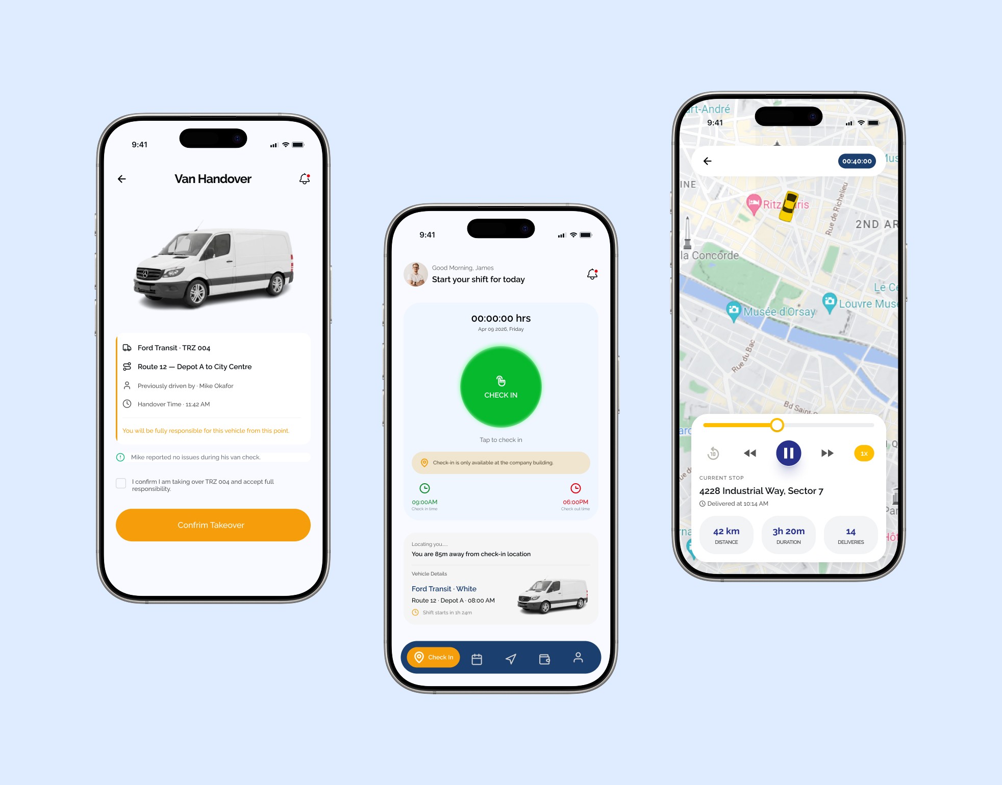
The Check-In Flow was the most critical screen sequence to get right. A driver starting a fresh shift goes through identity verification, a van condition check with photo uploads, route selection, and GPS activation all before tapping Start Trip. For van handovers between drivers, the app detects the active van and routes the incoming driver through a confirmation and condition check before transferring GPS tracking. Every step is deliberate accountability is built into the flow, not bolted on as an afterthought.
The Check-In Flow was the most critical screen sequence to get right. A driver starting a fresh shift goes through identity verification, a van condition check with photo uploads, route selection, and GPS activation all before tapping Start Trip. For van handovers between drivers, the app detects the active van and routes the incoming driver through a confirmation and condition check before transferring GPS tracking. Every step is deliberate accountability is built into the flow, not bolted on as an afterthought.

Safety & Wellbeing modules were designed to feel supportive rather than surveillance heavy. Daily safety scores, driving behavior alerts, and pre-shift fit-to-drive declarations were framed as tools that help the driver, not just data points for management. The wellbeing reporting was kept confidential and accessible a driver under stress shouldn't have to jump through hoops to flag it.

Payroll & Earnings gave drivers full visibility into their pay slips, overtime, bonuses, and deductions removing the information asymmetry that often creates friction between drivers and logistics companies. 12 functional modules. A complete mobile app designed from scratch, in three weeks.
The tight timeline demanded clear prioritization. Every design decision was filtered through one question: does this serve the driver's core workflow or complicate it? That discipline kept the app focused without sacrificing any of the required functionality.

Impact & Results
30+
Screens
12
Modules
In Development
In Development
In Development
Before Troz, driver management ran on manual processes, check-ins tracked informally, earnings communicated separately, incidents reported without structure. The app changed that. Twelve modules, one coherent system, designed in three weeks. Every driver now has everything they need in one place, from the moment they check in to the moment they log off.
Let's Create Something Amazing
Let's Create Something Amazing
I'm currently available for freelance projects and full-time opportunities. Let's discuss how I can help bring your vision to life.
I'm currently available for freelance projects and full-time opportunities. Let's discuss how I can help bring your vision to life.
© 2026 Promise Joseph. All rights reserved.
© 2026 Promise Joseph. All rights reserved.