Case Study

Role
Lead UX/UI Designer
Duration
3 months
Platform
Web & Mobile
Year
2026

Decision 01
Why: Users were dropping off at the homepage because they couldn't self-identify within 3 seconds. Splitting the entry point removes that ambiguity completely.
Decision 02
Why: A flat shared dashboard forces every user to do cognitive work upfront. Role-specific dashboards surface the right actions with zero hunting.
Decision 03
Why: Shrinking desktop to mobile loses context and creates friction. Professionals browsing jobs on their phone need a completely different flow than a client managing a project on desktop.
Decision 04
Why: Visual inconsistency breaks trust. When a user moves between web and mobile, the product should feel seamless same colour system, same typography, same language.
The homepage now routes each user type from the first second. Two CTAs, two journeys, zero ambiguity. Trust signals, ratings, verified profiles, recent activity are surfaced before a user has to search for them.

Dashboard
The dashboard was the retention layer where registered users actually live. I designed three separate dashboard experiences:
Clients — built around posting jobs, reviewing proposals, and tracking active projects without friction
Professionals — centred on finding work, submitting proposals, monitoring earnings, and building reputation
Admins — a structured operations view with dedicated modules for leads, user management, and response tracking
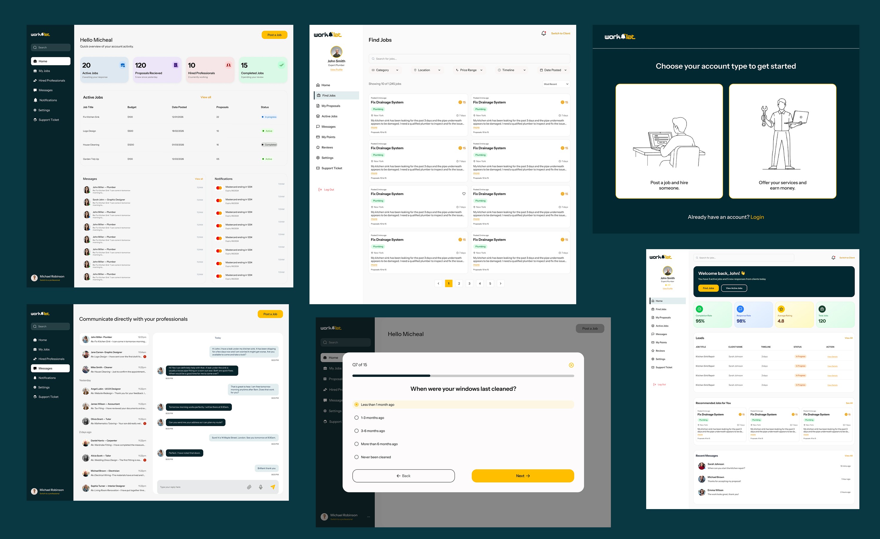
Mobile App
The mobile app was designed from scratch for both clients and professionals not shrunk from desktop, but rethought for touch. Every screen was rebuilt around how people actually use their phones: thumb-friendly navigation, simplified flows, and only the most critical actions surfaced at any given moment.
For clients, the app covers discovering professionals, posting jobs, and tracking active projects. For professionals, it puts earning opportunities, proposal submissions, and payment tracking directly in their pocket.
Despite being a completely separate surface, the app maintains full visual consistency with the web platform same color system, same typography, same component language so the product feels seamless across every device.

What was delivered.
100+
Pages & Screens
3
User Types
Launched
The original platform tried to serve everyone and ended up serving no one. The redesign gave each user type their own journey, restructured the dashboard around what actually matters, and added a mobile app from scratch. The platform now has the structure to do what it was always supposed to connect the right clients with the right professionals, without friction.